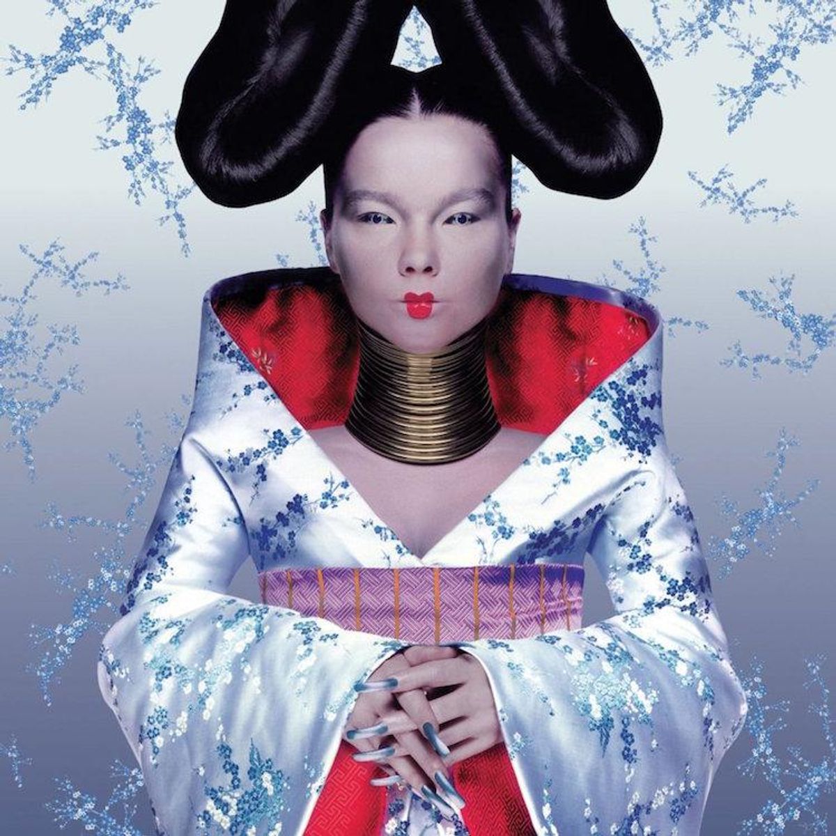
Emily Mackay's new book for 33 1/3 series examines Bjork's career-defining third album, Homogenic, released in 1997. This edited extract is taken from a chapter highlighting the Icelandic musician's iconic album artwork, which she created in collaboration with designer Alexander McQueen and photographer Nick Knight.
Today, we are accustomed to seeing Bjork as a multi-media auteur whose visual representations don't just match her musical output, but are a vital part of it. 'The least interesting question you could ask about the Bjork retrospective at New York's Museum of Modern Art is whether she deserves one,' observed the Guardian's Jason Farago in 2015. In 1996, however, while Bjork was lauded by style magazines such as Dazed & Confused and i-D, to many people she was still just a (sigh) 'kooky' pop star with weird fashion sense. Homogenic redefined her as an artist whose visual works were woven into the themes and purposes of her musical projects, cementing her image as an integral part of her art rather than a mere decoration or fashion choice. The album's accompanying sleeves, videos, stage sets and costumes formed a coherent, forceful artistic statement, integrated with the sonic and lyrical themes of the album: the unity of technology and nature, the need to find new ways to express national identity in a modern, global, technological world, and the challenges of love and how we meet them.
Bjork had, of course, always taken care of her visual presentations - in Kukl and The Sugarcubes, says MoMA director Klaus Biesenbach in Archives, 'she often took on the task of communicating and working with art directors, video directors, and photographers.' For Homogenic, however, she and her collaborators focused on aesthetic and thematic concerns even to the detriment of pragmatic, commercial ones. Homogenic's first single, 'Joga', determinedly set art over commerce by being released only as a 3-CD and VHS box set, and thus falling foul of singles chart rules in the UK. Though One Little Indian tried to persuade the charts bodies that the VHS of 'Joga' bundled in the set was effectively being given away free, the single was deemed ineligible by dint of having too many formats, and failed to chart. It set the tone for the delicate dance between art and pop the rest of Bjork's work would follow (though subsequent singles, sensibly, also had standard CD releases). Homogenic, like Debut and Post, did not feature either the album title or Bjork's name on its front sleeve, other than on a sticker. And it wasn't even, as those others had been, an instantly recognizable image of Bjork: just how she wanted it.
Bjork's visual collaborations, she's said, tend to be much more hands-off than her musical ones; not having the practical visual-art skills to match her musical talents, the important thing was to pick a person in sympathy with her vision, and explain the characters and worlds of her songs to them. In February 1997, while reading an issue of luxury art and fashion magazine Visionaire guest-edited by Comme Des Garcons founder Rei Kawakubo, an image jumped out at her. Shot in cold blue light and wearing an embroidered silk dress, Japanese-American model Devon Aoki sported a safety-pinned gash in her forehead, from which cherry-blossom bloomed. It was a collaboration between photographer Nick Knight and Alexander McQueen, then just a young London designer who worked at the darker, artier fringes of the fashion world. Something about it - the coldness, the hardness, the nature erupting from inside this digitally manipulated image - chimed with Bjork's Homogenic thoughts, and she approached Knight and McQueen about art-editing an album sleeve that would represent not just her, but the ideas of the album.
'She rang me up,' McQueen remembered, 'and she explained what the album was feeling: she said it was kind of a blue period in her life. It was a turn of phrase related to Bjork's hard year, of course, but Bjork had also been drawing inspiration from the evocative melancholy and humanism of Picasso's Blue Period paintings. Picasso was born in Malaga, not far from El Cortijo, and Bjork also wanted an image that reflected the way in which she was drawing from many sources, many countries, but still remaining herself. 'I was saying to Lee [McQueen], I'm like the most global citizen from Iceland,' she explained. 'When I'm in Iceland, I'm like the cosmopolitan, you know. When I'm in New York, I'm like the Icelandic person.' And so, for the Homogenic character, McQueen, Knight and stylist Katy England crafted their vision of the modern multicultural citizen: Maasai-style neck rings, a European manicure, a handmade damask silk Japanese-style kimono dress and butterfly-whorl hair inspired by the Native American women of the Hopi and Tewa tribes.
Bjork also wanted the image to evoke her warrior of love, and, as a result, the image bristles with a defensive tension that is heightened by the restrictive nature of her costume. 'I had the big head, the contact lenses, the long fingernails, sewn-back costume, I couldn't move but still had to send all the love in the world back to the camera,' she recalled. The image reflects the harder emotional tone of the songs within, turning from an idealistic view of love to one that won't be played, but won't give up either. It is Bjork-moulded armour, almost an exoskeleton, steely clawed, gunmetal-eyed; a visual counterpart to the idea that the songs of Homogenic are both a shed skin and a protection from the pressures of fame. 'It was quite an aggressive album, where I'd gone through five years of doing five billion interviews and being stalked,' she told Pitchfork in 2007. 'I was under a lot of pressure that I had never experienced before, so Homogenic was very much like the sleeve: we were trying to make this person that was under a lot of restraint, like long manicure, neckpiece, headpiece, contact lenses - still trying to keep the strength.
The sleeve embodies Bjork's refusal to choose between 'frivolous' fashion and 'serious' art, instead encompassing the two in her work. Though in her early years punk-at-heart Bjork had vehemently rejected the idea that she was a fashion person, she'd had fingers in both pies for a while; both Debut and Post's sleeves had been shot by fashion photographers with art-world cred (Jean-Baptiste Mondino and Stephane Sednaoui, respec- tively) and Bjork had modelled for Jean-Paul Gaultier, a catwalk turn that appeared in Robert Altman's Pret-a- Porter. Her dress sense had always been adventurous, led by her anarchist-surrealist trust in instinct. She'd once, she proudly relayed in interviews, demanded to be allowed to wear a duvet cover to school as a child, and as an adult she still figured that if she wanted to wear neon, fake fur, paper, why question herself? It also aided better expression of her music's themes: 'If I look the way I sound, that helps me, because people are much more trained visually than they are audio-wise.' Clothes, like her characters, were a way of expressing what was, or what had been, going on inside. For Bjork, fashion is also a way of shifting shape.
Homogenic by Emily Mackay is out now.


